Use List Box Item Container 2D with Grid List Box 2D nodes and List Box Item Container 3D with Grid List Box 3D and Trajectory List Box 3D nodes. See Using the Grid List Box nodes and Using the Trajectory List Box 3D node.
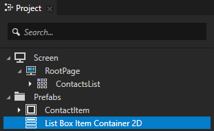
For example, create a List Box Item Container 2D.
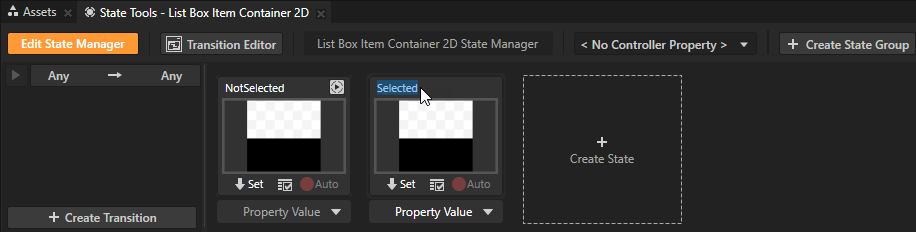
For example, name one state NotSelected and the other Selected. The Selected state defines the state of your application when an item in the list box is selected, the NotSelected state when the item is not selected.
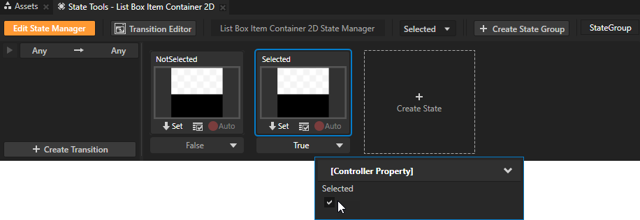
For example, for the Selected state set the value to True and for the NotSelected state leave the value set to False.
In a state manager the value of the property you select as the Controller Property defines the conditions when each state in a state group is active.
For example, to change the background color of the selected item and make an image appear over it:
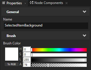
- Create two color brushes, one for the background of the selected item and another one for the background of the other items. See Creating color brushes.
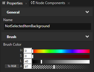
For example, create one Color Brush called NotSelectedItemBackground and another lighter one called SelectedItemBackground.
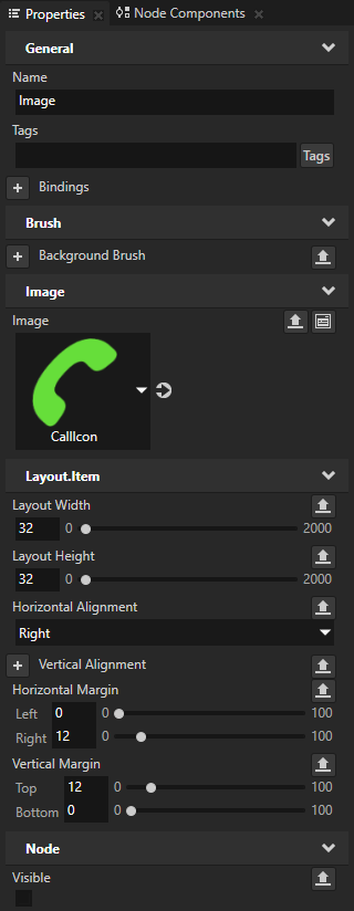
- In the Project press Alt and right-click the List Box Item Container 2D prefab, select Image, and in the Properties:
- Set the Image property to the image you want the Image node to show.
- Add the Visible property.
- (Optional) Add and set the image size and position properties. See Using the Image node.
- In the Project select the List Box Item Container 2D prefab and in the Properties add the Background Brush property and set it to NotSelectedItemBackground. In the State Tools click
 below the NotSelected state to save the property value to that state. Then set the Background Brush property to SelectedItemBackground and save the value to the Selected state.
 - In the Project select the List Box Item Container 2D > Image prefab and in the Properties enable the Visible property. In the State Tools click below the Selected state to save the property value to that state.
- In the State Tools click Edit State Manager to deactivate the State Tools.
The Selected state now has a lighter background and an image, and the NotSelected state has a darker background with no image.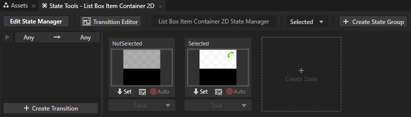
For example, use the List Box Item Container 2D prefab to set the appearance of the selected item in a Grid List Box 2D:
- Select or create a Grid List Box 2D node and add items to it. See Using the Grid List Box nodes.
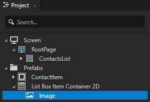
For example, create a Grid List Box 2D node called ContactsList and use it as a container to present address book contacts.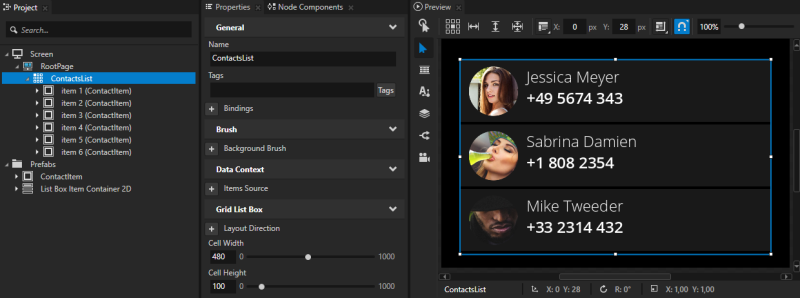
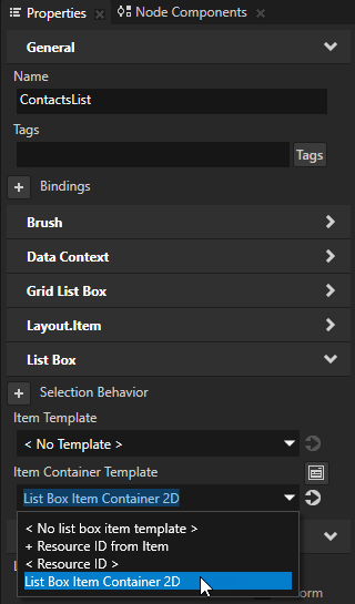
- In the Project select the Grid List Box 2D node the selected item of which you want to change and in the Properties add and set the Item Container Template property to the List Box Item Container prefab that you want to use.
For example, select the ContactsList node and in the Properties add and set the Item Container Template property to List Box Item Container 2D.
The Item Container Template property allows you to share functionality between the items in a list box. When you set the Item Container Template property, each item in the list box inherits the functionality from the List Box Item Container node. For example, the Item Container Template can contain a state manager which changes the scale of the selected item in the list box. This way you do not need to set the functionality for each item.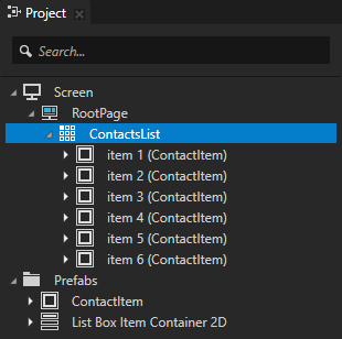
In the Preview when you click an item in the ContactsList to select it, its appearance changes.
